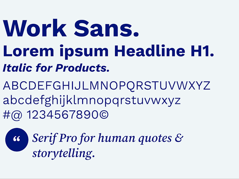
Colors.
The Ottobock color palette is now streamlined to convey a clean, distinctive, impactful look. We also want to leverage the accessibility level for digital touchpoints so therefore we use from now on an enhanced blue palette as basis for our design elements and typography.
Life long blue is the new Ottobock blue that establishes a strong recognition for global communication. For digital touchpoints we have specific cases that allow semantic colors to shine through.
1 Ergebnisse von insgesamt 1
Primary colors.

Life long blue #00157A
This primary color is the enhanced main blue color of Ottobock and is used for: Ottobock logo wordmark, headline messaging, infographics and for UX/UI elements.
This primary color is the enhanced main blue color of Ottobock and is used for: Ottobock logo wordmark, headline messaging, infographics and for UX/UI elements.

Pulse blue #39B1C3
This color should be used to focus the user on accentuated key messages (e.g. user quotes) or highlighting specific information (e.g. tables, infographics) and related content.
This color should be used to focus the user on accentuated key messages (e.g. user quotes) or highlighting specific information (e.g. tables, infographics) and related content.

Oxygen blue #C1E6EF
The usage of this blue tone is limited for monochromatic areas and backgrounds (e.g. content moduls).
The usage of this blue tone is limited for monochromatic areas and backgrounds (e.g. content moduls).
3 Ergebnisse von insgesamt 3
Secondary colors.
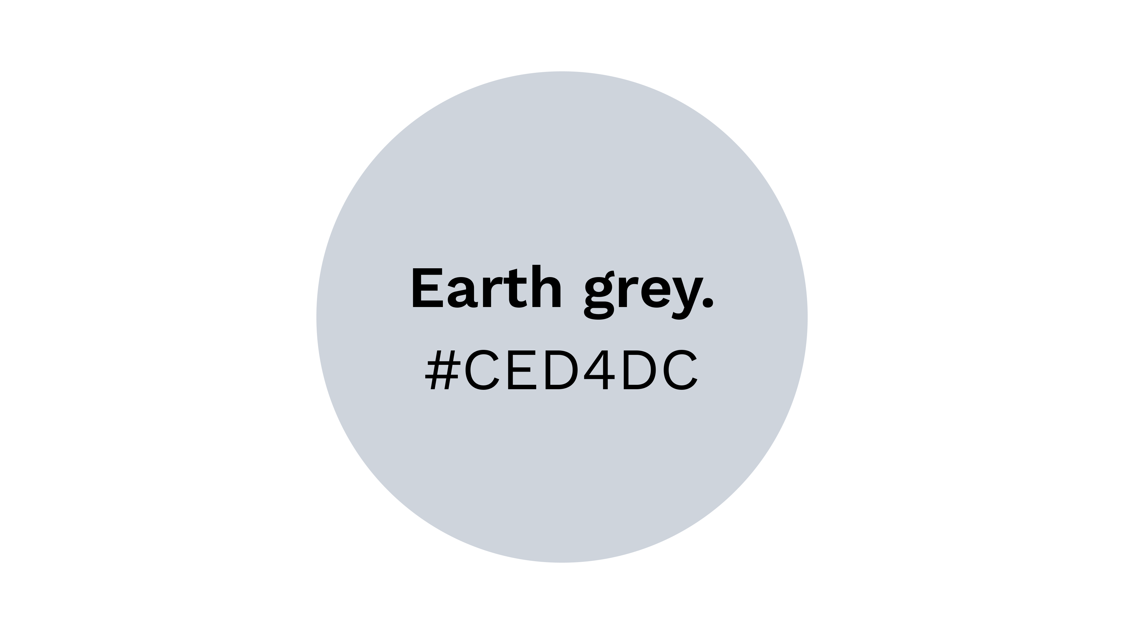
Earth grey #CED4DC
The usage of this grey tone is limited for monochromatic areas and backgrounds (e.g. content modules).
The usage of this grey tone is limited for monochromatic areas and backgrounds (e.g. content modules).
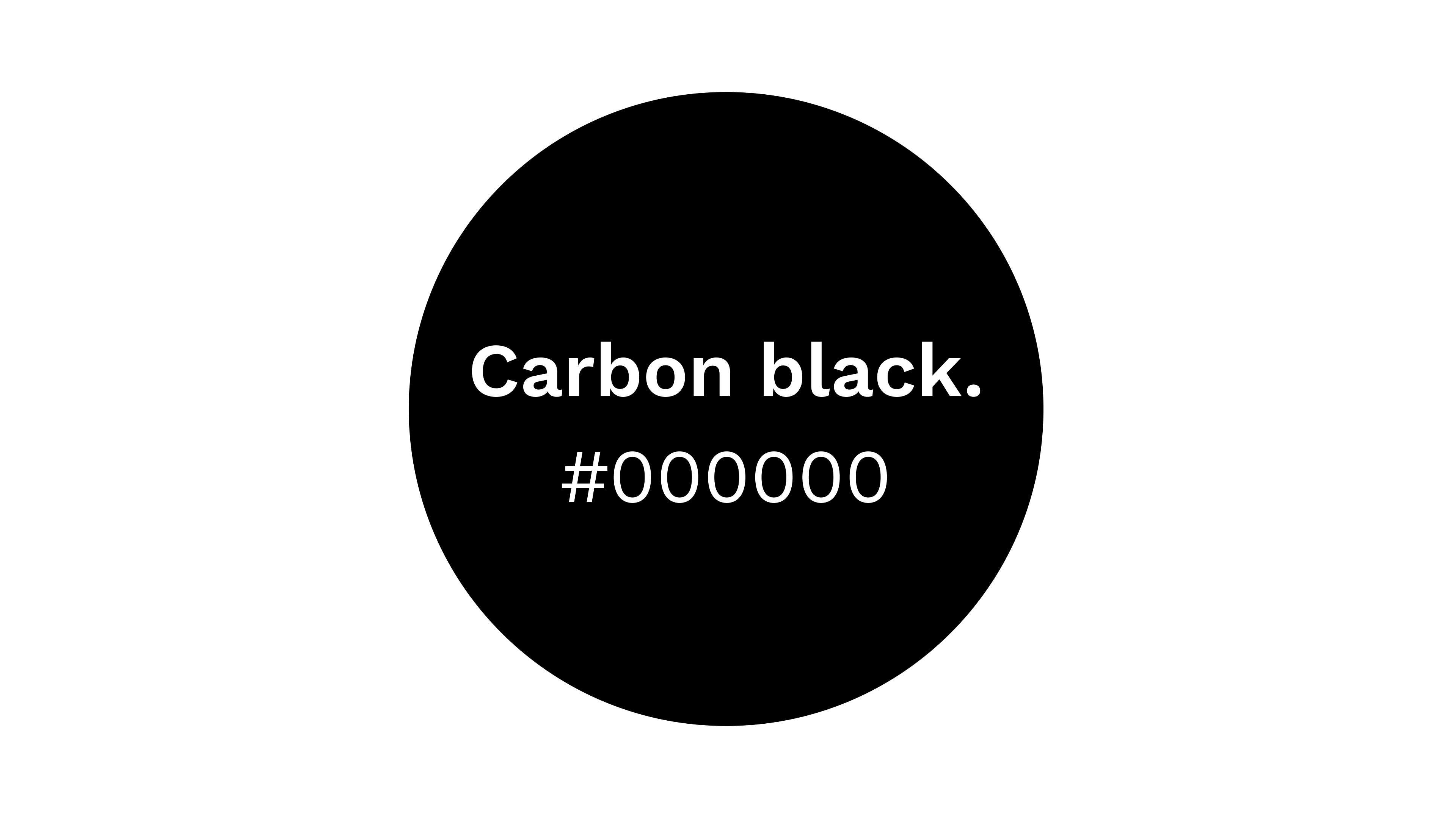
Carbon back. #000000
This color is used for smaller headlines (e.g. H2...), copy and other text types.
This color is used for smaller headlines (e.g. H2...), copy and other text types.
2 Ergebnisse von insgesamt 2
Semantic colors.
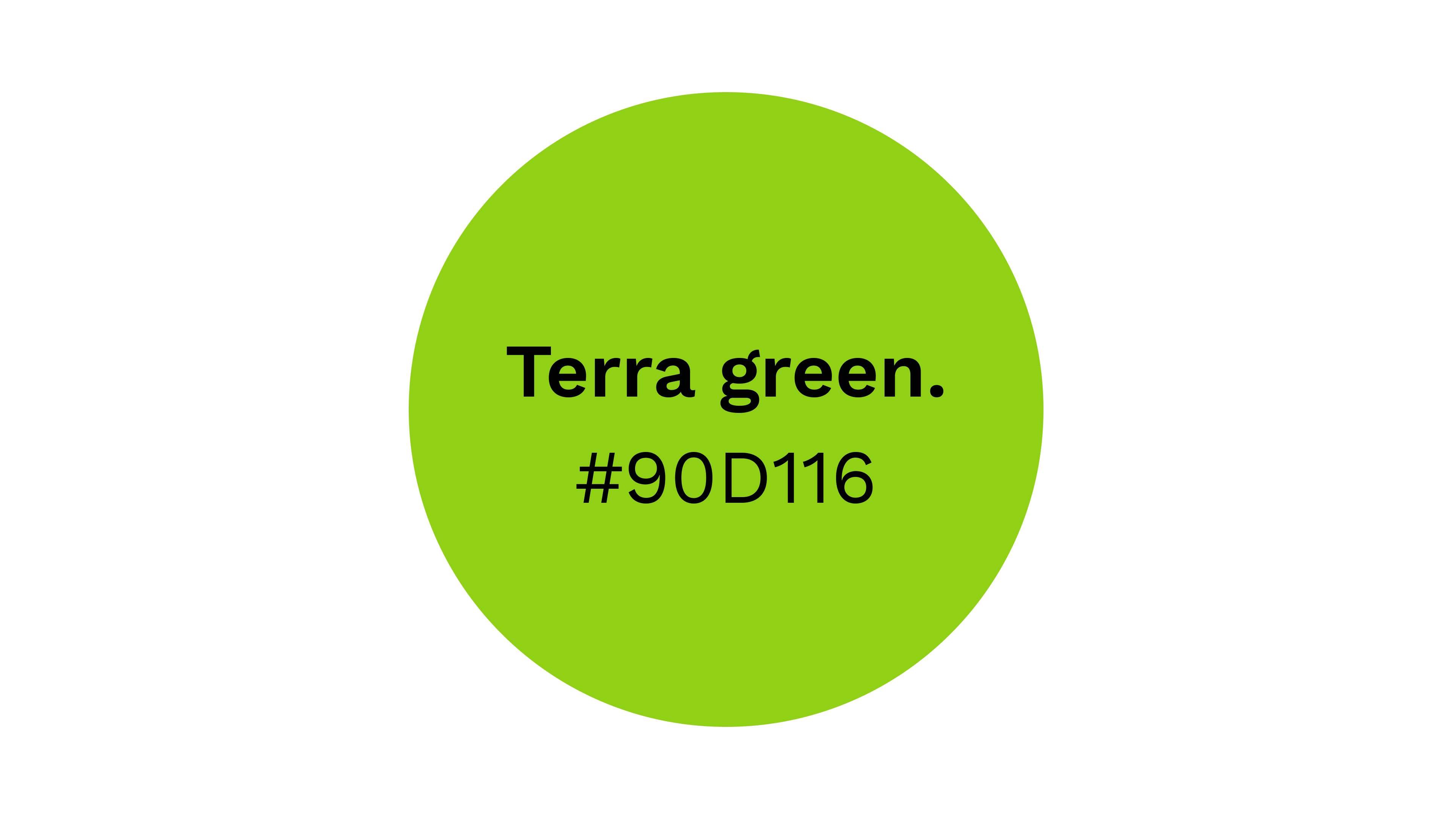
Terra green. #90D116
This second semantic color is also used in a UX/UI context. Exclusively for all Ottobock digital platforms and digital solutions (e.g. apps, for visual feedback).
This second semantic color is also used in a UX/UI context. Exclusively for all Ottobock digital platforms and digital solutions (e.g. apps, for visual feedback).
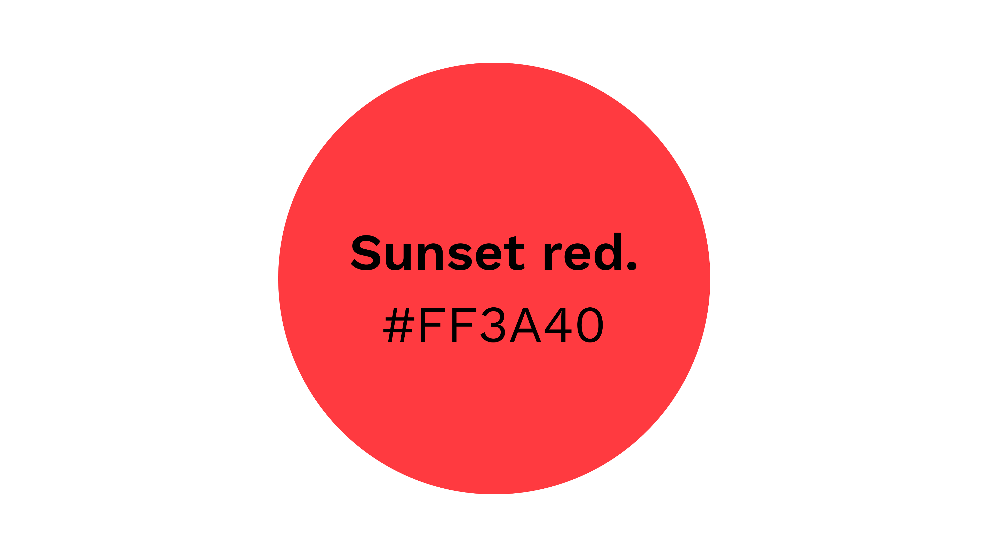
Sunset red. #FF3A40
Semantic colors are only used in a UX/UI context. Exklusively for all Ottobock digital platforms and digital solutions (e.g. apps, for visual feedback).
Semantic colors are only used in a UX/UI context. Exklusively for all Ottobock digital platforms and digital solutions (e.g. apps, for visual feedback).
2 Ergebnisse von insgesamt 2
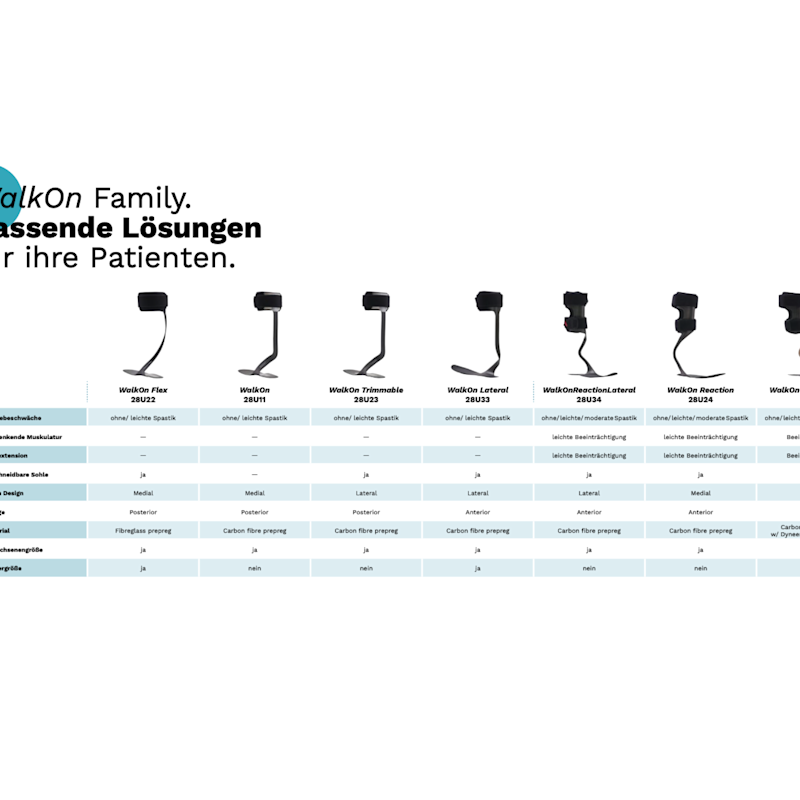
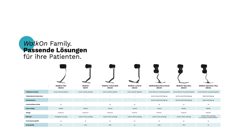
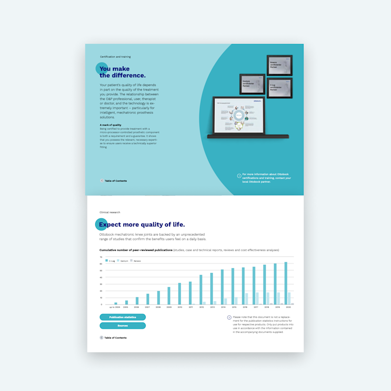
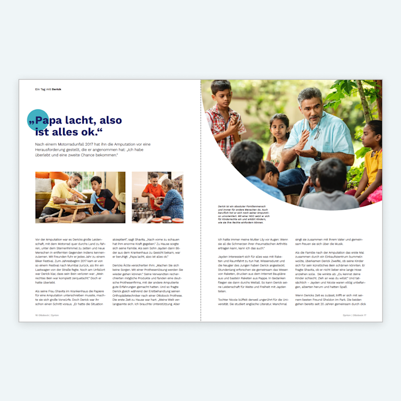
Print examples.
Print examples.
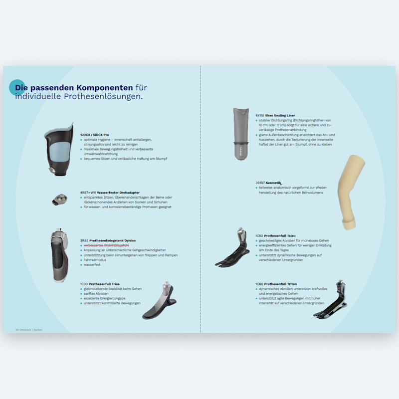
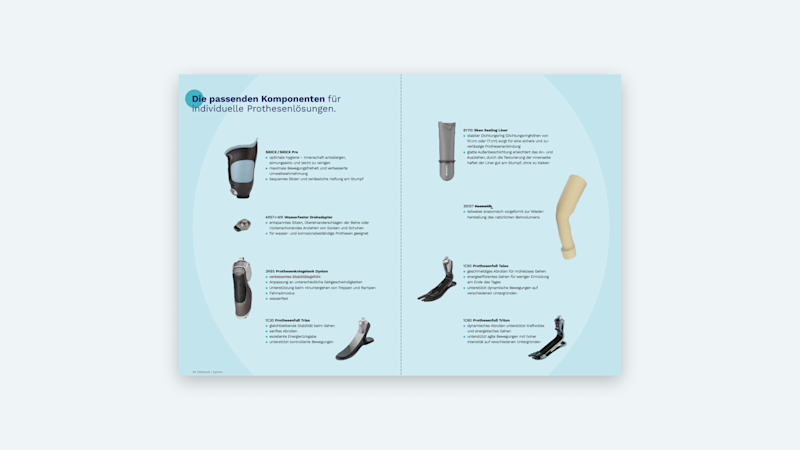
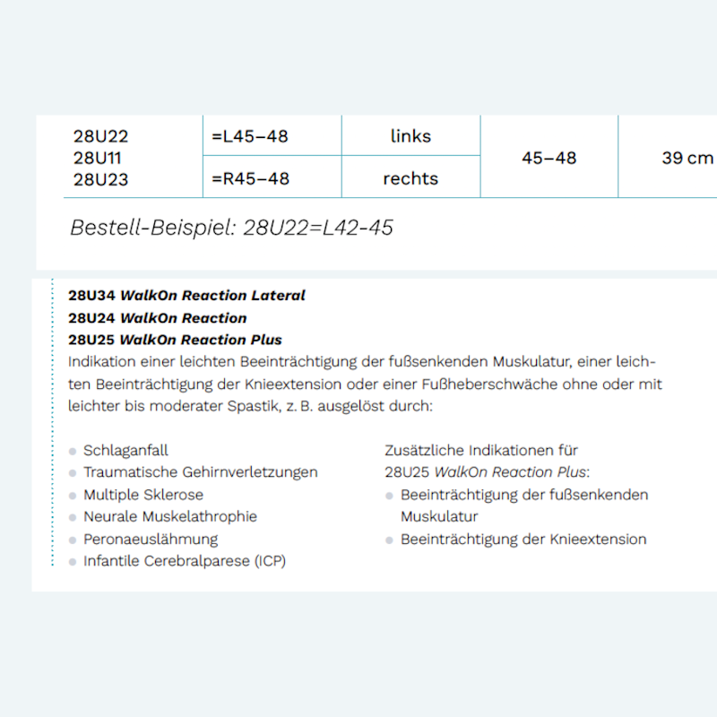
We streamlined the way how to structure complex information. Especially when it comes to communicate detailed product information for our key audiences, a clear usage of colors and typographic hierarchy ensures better guidance. Find in this section best practices how to build information the right way.
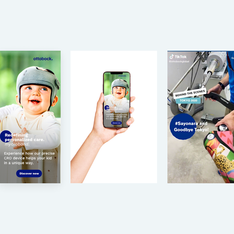
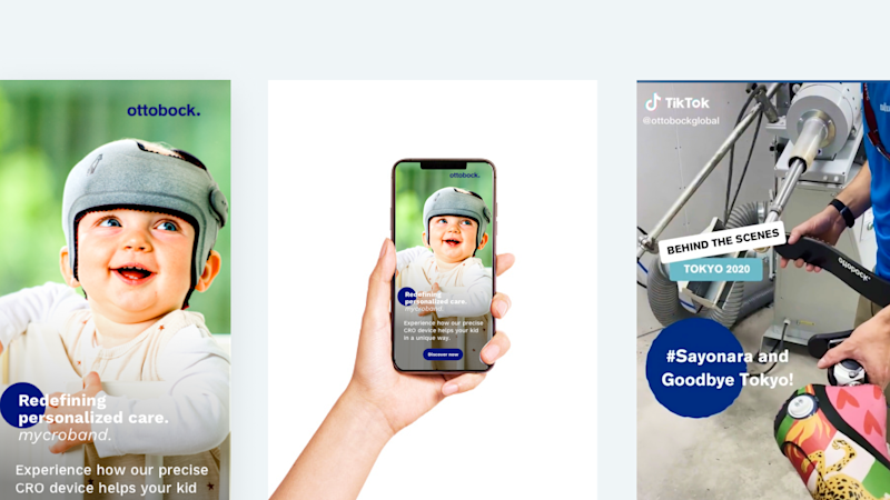
Digital examples.
Digital examples.
For digital we make use of all standard ad and experience formats to drive awareness and conversion for our brand.